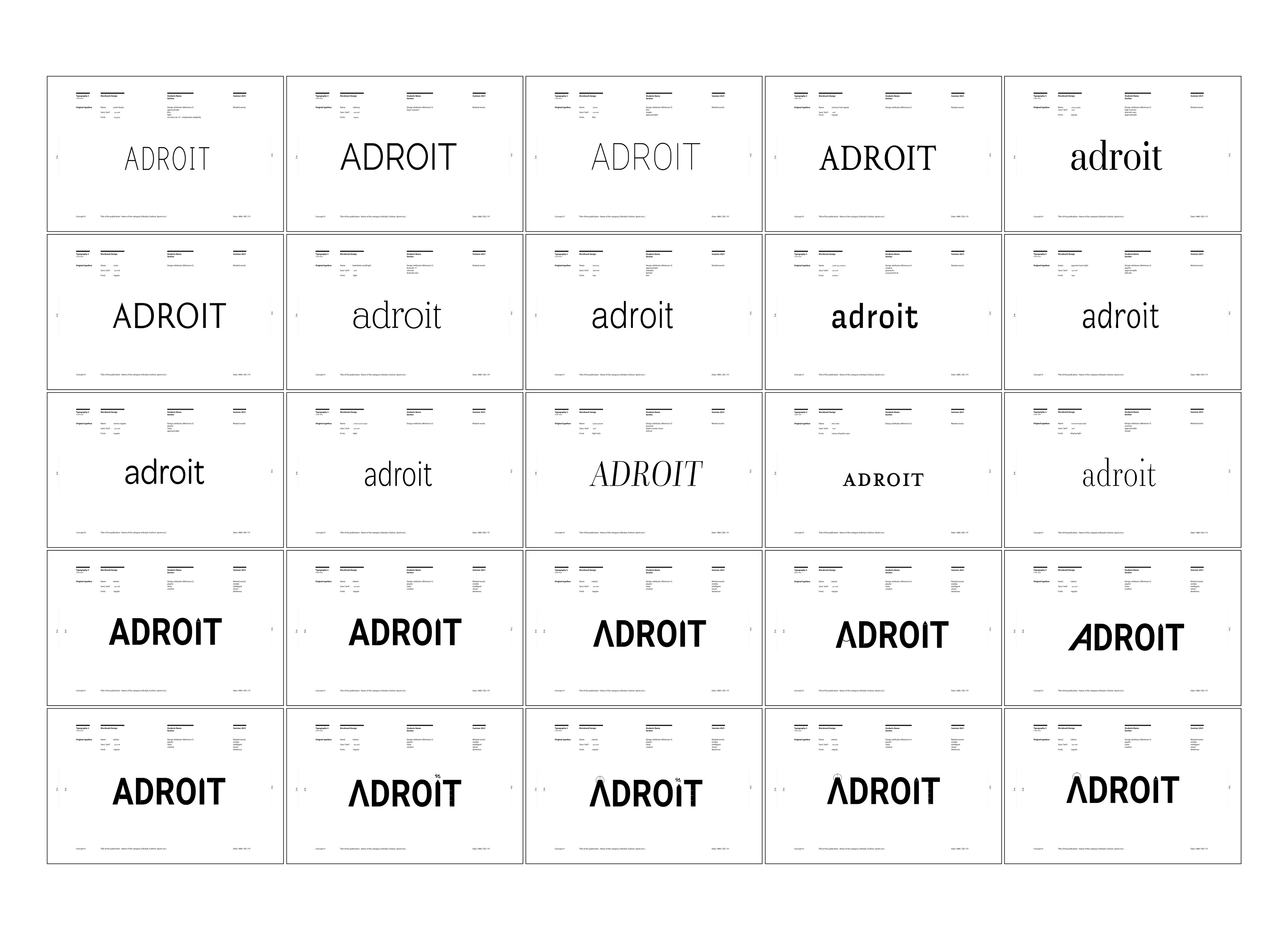
Wordmark process
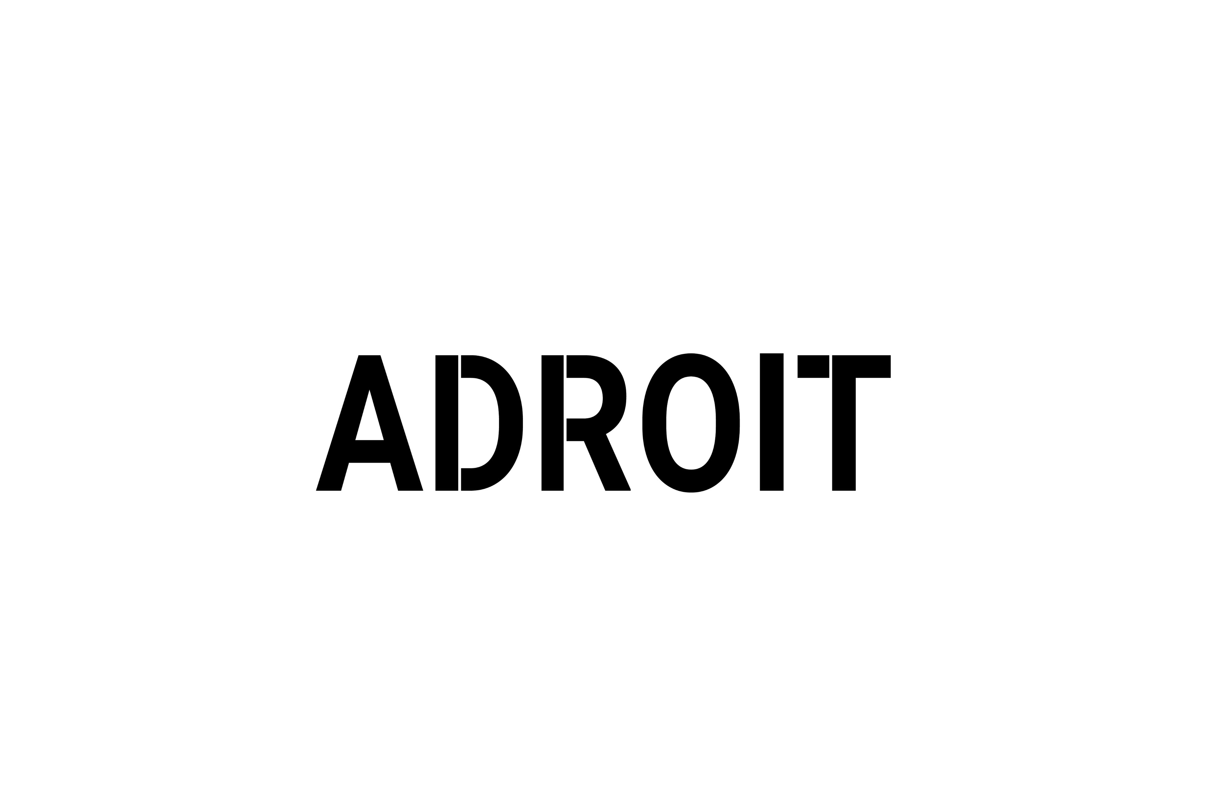
Final wordmark
I wanted the essence of my magazine to be confident, creative, and clean. I chose to use Roboto as my original typeface because of its readability as well as the elegant contrasts between letters - that evoke presence and confidence.
The term “Adroit” means skillful, so I experimented with making each letter look like a design tool (t-square, pencil, compass, etc) to enhance the meaning of the word.
After trying multiple literal interpretations, I decided to play more with the unit increments one would see on a ruler or t-square. This created a wordmark that was minimal and closer to the substance of my magazine.
Cover process
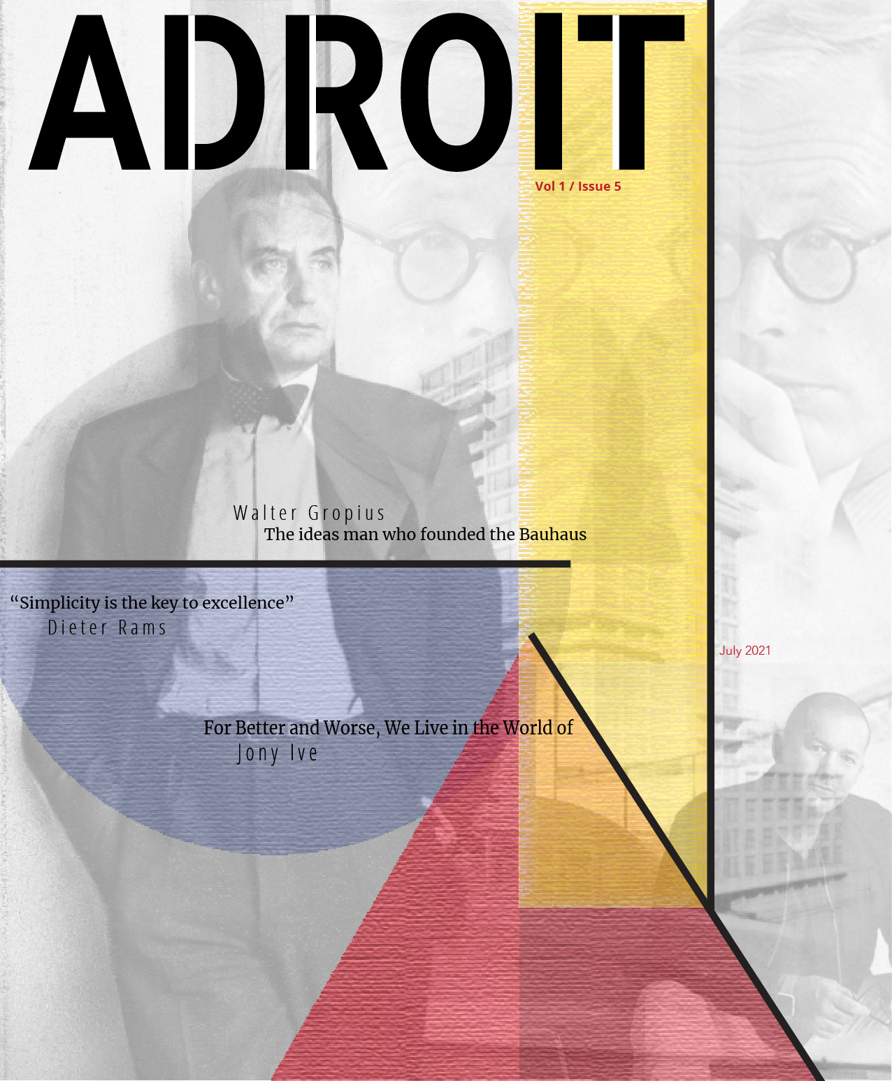
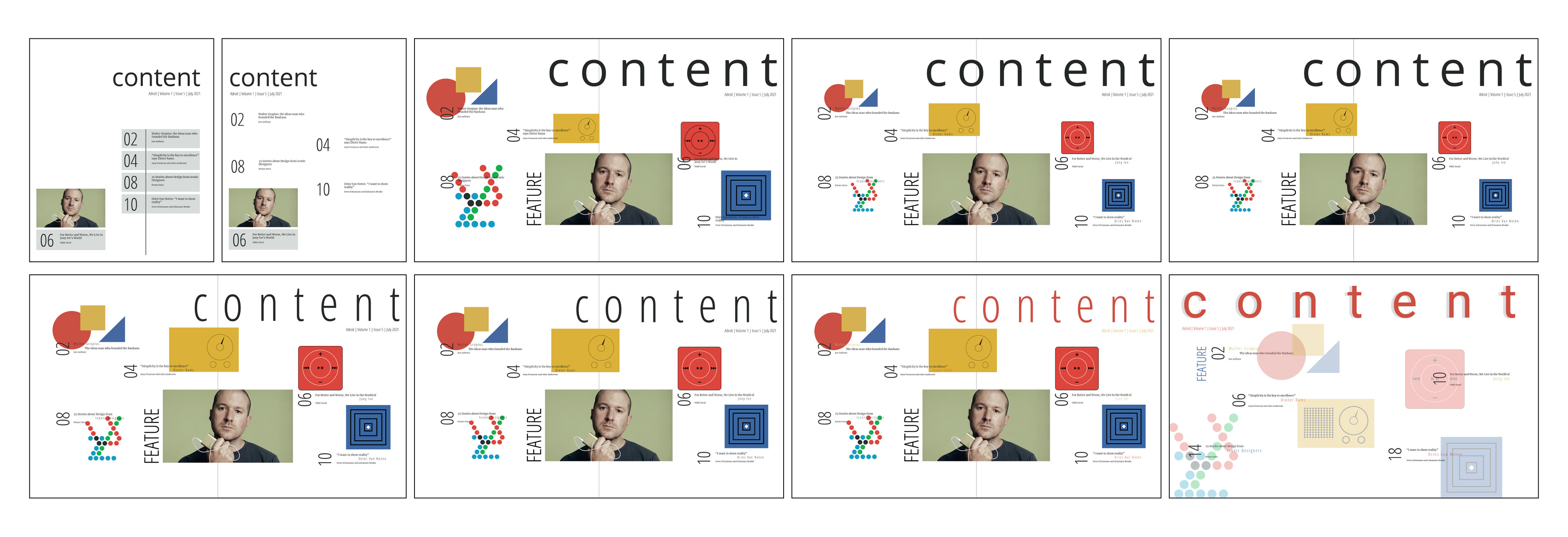
I wanted to keep the cover design simple yet professional. My first few iterations highlighted Walter Gropius as he was my feature article. I created a Bauhaus-inspired sketch of Gropius and placed that on the third iteration in the front row.
The second batch of iterations includes Bauhaus-inspired elements as well as a Bauhaus-inspired color palette. I kept Gropius as the highlight in the background but I experimented with that in later iterations.
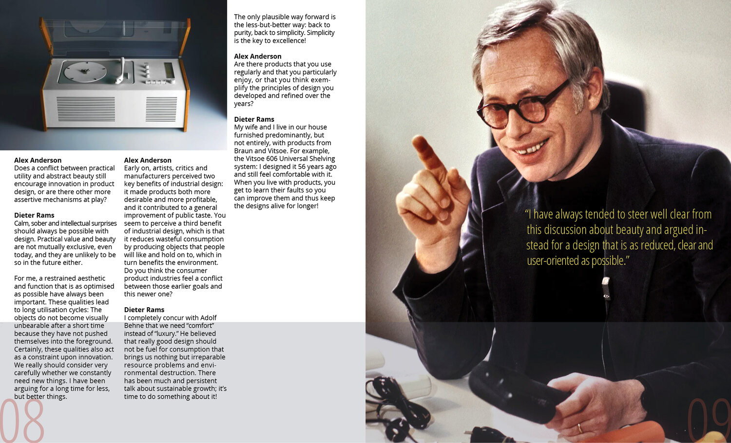
I experimented with a pointillism effect applied to a Coffee maker created by Dieter Rams. This ended up being omitted from my final cover as I felt it to be distracting and may not be recognizable for what it is and/or which designer it relates to.
I wanted to collage the designers featured in my magazine to give insight as to what one might expect from the publication just by looking at the cover.
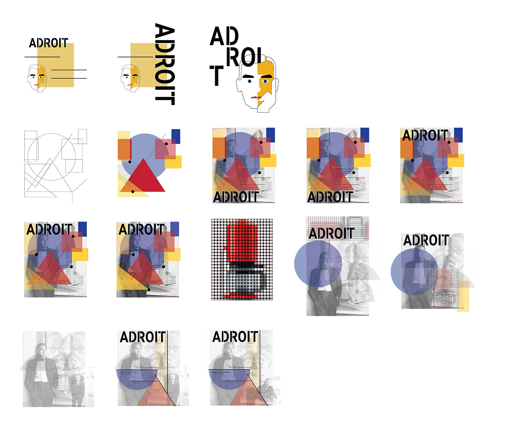
Table of Contents process
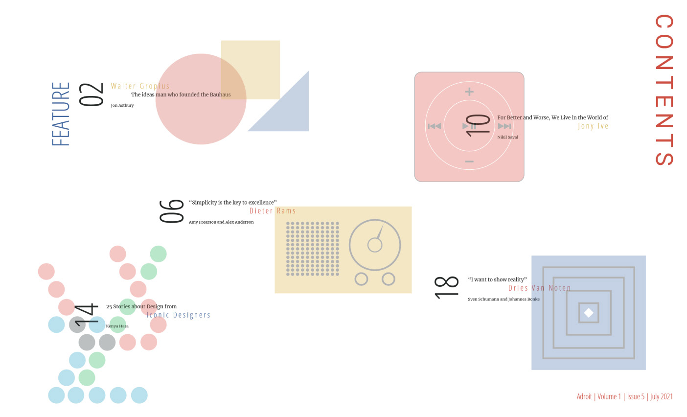
Final Table of Contents
I created graphic elements that relate to the specific article they are next to: Bauhaus elements, Dieter Rams' radio, Jony Ive's iPod, Massimo Vignelli's subway map, and a pattern inspired by Dries Van Noten's design work.
Article spread iterations
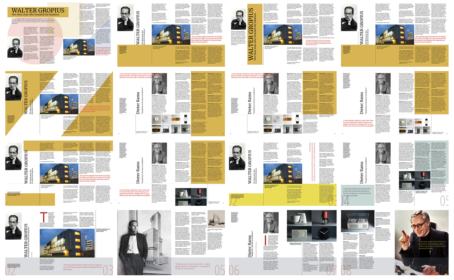
Final